큰 구조 먼저 잡기

header랑 main footer 감싸고 있는 wrap 필요
css 리셋파일에 추가로 아래와 같이 아웃라인 없애줬다.
header
< 로고 >
 <body>
    <div id="wrap">
      <header>
        <div class="header_wrap">
          <!-- 로고 -->
          <h1>
            <a href="/"><img src="./img/logo.png" alt="로고" /></a>
          </h1>
css
body {
  font-family: "Roboto", sans-serif;
  font-size: 20px;
  line-height: 38px; /*라인하이트는 글꼴 사이즈의 두배 조금 안되게 잡아준다*/
  font-weight: 300;
  color: #3f3d56;
}
#wrap {
  width: 100%;
  height: auto;
}
먼저 body를 불러와서 기본적으로 쓸 font-size랑 line-height, weight 등을 설정해준다.
로고 css
header {
  width: 100%;
  height: 100px;
  position: absolute; /*앱솔루트를 줘서 해더와 메인비주얼을 겹쳐줬다 포지션을 주면 그때부터 브라우저로부터 살짝 떨어짐.*/
  top: 0;
  left: 0;
  right: 0; /*넣어도되고 안넣어도 되고*/
  z-index: 999; /*아래에 애들 포지션 주게 되면 걔네들이 더 치고 올라와서 해더를 가장 위 레이어로 올려준다*/
}
.header_wrap {
  width: 1600px;
  height: 100px;
  margin: 0 auto;
  display: flex;
  justify-content: space-between;
  column-gap: 60px; /*메뉴바 오른쪽 이동을 위해서 */
}
/* 로고는 h1 영역 설정해주고 그 안에 이미지를 맥스로 넣어준다. */
h1 {
  width: fit-content;
  height: 28px; /*이미지크기 그대로 적용*/
  padding: 36px 0;
}
h1 > img {
  max-height: 100%;
}
- header와 메인 비주얼을 겹쳐지게 하기 위해서 header에 position: absolute 준다.
( position을 주면 그때부터 브라우저로부터 떨어지게 된다. )
- z-index를 줄려면 position을 줘야한다.
- z-index를 줘서 해더를 가장 위쪽 레이어로 올려준다. 큰 값을 줄수록 위쪽으로 올라온다.
< 메뉴 >

<nav>
            <ul>
              <li>
                <a href="#">about</a>
                <ul class="submenu">
                  <li><a href="#">menu1</a></li>
                  <li><a href="#">menu2</a></li>
                  <li><a href="#">menu3</a></li>
                </ul>
              </li>
              <li>
                <a href="#">product</a>
                <ul class="submenu">
                  <li><a href="#">menu1</a></li>
                  <li><a href="#">menu2</a></li>
                  <li><a href="#">menu3</a></li>
                </ul>
              </li>
              <li>
                <a href="#">sale</a>
                <ul class="submenu">
                  <li><a href="#">menu1</a></li>
                  <li><a href="#">menu2</a></li>
                  <li><a href="#">menu3</a></li>
                </ul>
              </li>
              <li>
                <a href="#">community</a>
                <ul class="submenu">
                  <li><a href="#">menu1</a></li>
                  <li><a href="#">menu2</a></li>
                  <li><a href="#">menu3</a></li>
                </ul>
              </li>
              <li>
                <a href="#">contact</a>
                <ul class="submenu">
                  <li><a href="#">menu1</a></li>
                  <li><a href="#">menu2</a></li>
                  <li><a href="#">menu3</a></li>
                </ul>
              </li>
            </ul>
          </nav>
css
nav {
  width: 630px;
  height: auto;
  margin-left: auto; /*메뉴바 오른쪽에 붙이기위해서 해더 랩에 갭 준다음에 마진레프트처리*/
}
/* 1차메뉴 가로정렬할려면 ul에 플렉스. 부모박스에 직접 적용해야하니깐 */
nav > ul {
  width: 100%;
  height: auto;
  display: flex;
  justify-content: space-between;
  text-align: center;
  line-height: 100px; /*라인하이트를 높이값으로 넣어서 1차메뉴들을 가운데정렬*/
}
/* 1차메뉴 안에 있는 모든 a태그 */
nav > ul > li a {
  color: #fff;
  font-size: 22px;
}
/* 1차메뉴 */
nav > ul > li > a {
  font-weight: 400;
}
/* 1차메뉴 a태그 호버 색상 바꾸기 */
nav > ul > li > a:hover {
  color: #f50057;
}
/* 2차메뉴 */
.submenu {
  line-height: 40px; /*높이값을 대신*/
  height: 0;
  overflow: hidden; /*2차메뉴 숨기기*/
  transition: height 0.3s; /*높이만 0.3초동안 적용하겠다*/
}
.submenu a:hover {
  color: #f50057;
}
/* 2차메뉴 한번에 나타내기 ul에 호버하면 전체가 나오고 li에 호버하면 해당하는 서브메뉴만 나오고*/
nav > ul:hover > li .submenu {
  height: 120px; /*서브메뉴에 라인하이트로 개당 40잡아놔서*/
}
- 메뉴바를 오른쪽으로 치우치게 위치하게 할때는 해더 컨텐츠를 감싸고 있는 div에 colum-gap을 준 다음
nav에 margin-left:auto; 를 줘서 오른쪽으로 위치하게 한다.
- 1차 메뉴들 가로 정렬할때는 ul에 디스플레이 플렉스 걸어주기
- 1차 메뉴들 가운데 정렬할 때는 line-height로 위치 잡기
* 1차 메뉴들에 마우스 올리면 색 변하기
nav > ul > li > a:hover {
  color: #f50057;
a 에 hover 올리면, 이라고 해줘야한다.
li뒤에 hover쓰면 li영역에 올라갔을때도 색 바뀌게 된다.
> 2차 메뉴
2차메뉴들의 높이는 line-height로 잡아준다.
2차 메뉴 숨길때는 overflow:hidden으로 숨겨준다. (1차메뉴에 마우스를 올렸을 때, 2차메뉴가 스르륵 펼쳐지게 할려면 overflow:hidden을 써서 2차 메뉴를 숨겨놔야한다. 디스플레이 논으로 숨기면 스르륵 펼쳐지지가 않는다.)
transition: height 0.3s; /*높이만 0.3초동안 적용하겠다*/transition에 height를 지정해주면 높이만 0.3초 적용할 수 있다.
* 2차메뉴 한번에 나타내기
ul에 호버하면 전체가 나오고 li에 호버하면 해당하는 서브메뉴만 나온다.
nav > ul:hover > li .submenu {
  height: 120px; /*서브메뉴에 라인하이트로 개당 40잡아놔서*/
}
- 전체 메뉴 나타내기
<아이콘>
<div class="icon">
            <a href="#"><img src="./img/login.png" alt="로그인" /></a>
            <a href="#"><img src="./img/menu.png" alt="전체메뉴" /></a>
          </div>
        </div>
      </header>
css
.icon {
  width: fit-content;
  height: 48px;
  display: flex;
  column-gap: 40px;
  padding: 26px 0;
}
.icon > a {
  display: block; /*넓이높이주기위해 속성 바꿔줬다*/
  width: 48px;
  height: 48px;
  box-sizing: border-box;
}
.icon > a:first-child {
  padding: 11px;
}
.icon > a:last-child {
  padding: 8px 11px;
}
아이콘은 a태그 안에 들어있어야하고, a태그는 인라인 속성이니깐
넓이를 주기 위해 블럭 속성으로 바꿔줌.
Main
< 메인 비주얼 >

      <main>
        <!-- 메인비주얼 -->
        <section id="main_visual">
          <div class="main_title">
            <h2>We are big explorers.</h2>
            <p>
              We are always looking for your needs.<br />
              What are you waiting for?<br />
              Come With Us!!!
            </p>
          </div>
          <div class="main_thumb1">
            <img src="./img/bg_img1.png" alt="메인이미지" />
          </div>
          <div class="main_thumb2">
            <img src="./img/bg_img2.png" alt="메인이미지" />
          </div>
        </section>
css
main {
  width: 100%;
  height: auto;
}
/* 공통속성 */
main > section {
  position: relative; /*모든 섹션이 좌표값을 각 가질수 있게*/
  width: 100%;
}
/* 컨텐츠영역 1600 공통속성 */
.con {
  width: 1600px;
  overflow: hidden;
  margin: 0 auto;
}
#main_visual {
  width: 100%;
  height: 850px;
  background-color: #19163c;
  position: relative;
  overflow: hidden;
}
.main_title {
  width: 600px;
  overflow: hidden;
  color: #fff;
  text-align: center;
  position: absolute; /*z-index 줄려면 포지션 있어야함*/
  /* 가운데에 위치하게 할려면 left50%한다음 텍스트박스 크기절반만큼을 마진 레프트로 끌어당긴다. */
  left: 50%;
  margin-left: -300px;
  top: 50%;
  margin-top: -90px;
  z-index: 10;
}
.main_title h2 {
  color: #f50057;
  font-weight: 700;
  font-size: 50px;
  text-transform: uppercase; /*대문자 전환*/
  border-bottom: 2px solid #fff;
  padding-bottom: 8px; /*글자 아래 줄 띄워줌*/
  margin-bottom: 20px;
}
.main_title p {
  font-size: 24px;
}
.main_thumb1 {
  width: 888px; /*넓이 이미지사이즈 고대로 잡아준다*/
  height: 786px;
  position: absolute;
  animation: moving_man 3s linear 0s infinite;
}
.main_thumb2 {
  width: 821px;
  height: 640px;
  position: absolute;
  animation: moving_woman 2s linear 0s infinite;
}
/* 이미지는 이미지를 감싸고 있는 div에 이미지 사이즈를 지정해준다음 이미지에 max width나 height를 써서 크기를 맞춰준다. */
.main_thumb1 > img,
.main_thumb2 > img {
  max-width: 100%;
}
@keyframes moving_man {
  from {
    top: 100px;
  }
  50% {
    top: 150px;
  }
  to {
    top: 100px;
  }
}
@keyframes moving_woman {
  from {
    top: 120px;
    right: 0px;
  }
  50% {
    top: 140px;
    right: -20px;
  }
  to {
    top: 120px;
    right: 0px;
  }
}
1. 먼저 섹션들의 공통 속성을 지정해준다. 모든 섹션은 width 100%에 각각의 좌표를 가질 수 있도록 position: relative;을 걸어줬다.
2. 섹션 안에 컨텐츠 영역을 .con 으로 공통으로 지어주고 공통 속성을 지정해준다. .con -> width: 1600px;
- 메인비주얼에 글자는 이미지보다 레이어가 위에 위치해야함으로 z-index 로 올려주었다. 이때 z-index 쓸려면 포지션이 걸려있어야 한다.
- 메인비주얼 글자가 포지션 엡솔루트인 상태에서 가운데에 위치하게 할려면,
먼저 left:50%로 가운데로 보내주면 박스는 가운데에 위치하게 되는데 박스의 왼쪽 모서리가 기준이라 가운데에 빨간 박스처럼 위치하게 된다. 그래서 박스 사이즈의 절반 만큼을 margin-left 로 다시 끌어당겨줘야한다.

* 이미지는 이미지를 감싸고 있는 div에 이미지 사이즈를 지정해 준 다음 이미지에 max width나 max height:100%를 써서 크기를 맞춰준다. - 반응형까지 고려하여
> 애니메이션
.main_thumb1 {
  width: 888px; /*넓이 이미지사이즈 고대로 잡아준다*/
  height: 786px;
  position: absolute;
  animation: moving_man 3s linear 0s infinite;
}
.main_thumb2 {
  width: 821px;
  height: 640px;
  position: absolute;
  animation: moving_woman 2s linear 0s infinite;
}

.main_thumb1 > img,
.main_thumb2 > img {
  max-width: 100%;
}
@keyframes moving_man {
  from {
    top: 100px;
  }
  50% {
    top: 150px;
  }
  to {
    top: 100px;
  }
}
@keyframes moving_woman {
  from {
    top: 120px;
    right: 0px;
  }
  50% {
    top: 140px;
    right: -20px;
  }
  to {
    top: 120px;
    right: 0px;
  }
}
여자 이미지는 약간 대각선으로 움직일거라서 right 좌표를 음수로 해서 위치를 뒤로 빼준다.
< 섹션 2 >

<section id="second">
          <div class="con">
            <div class="left_text">
              <h3>WHAT WE DO?</h3>
              <p>
                We find what we like<br />
                through your search.<br />
                And it provides better <br />information.
              </p>
              <a href="#">How do you find it?</a>
            </div>
            <div class="corder">
              <img src="./img/coders.png" alt="코딩중" />
            </div>
          </div>
        </section>
이미지는 div로 묶어서 그 안으로 데려온다.
css
#second {
  height: 900px;
  background: url(./../img/bg_02.png), url(./../img/bg_01.png);
  background-repeat: no-repeat;
  background-position: bottom;
}
.left_text {
  width: 500px;
  overflow: hidden;
  float: left;
  text-align: center;
  padding: 261px 0;
}
.left_text > h3 {
  font-size: 24px;
  font-weight: 900;
  font-style: italic;
}
.left_text > h3::after {
  display: block;
  content: "line";
  font-size: 0;
  width: 20px;
  height: 1px;
  background-color: #f50057;
  margin: 20px auto;
}
.left_text p {
  font-size: 30px;
  line-height: 45px;
  margin-bottom: 50px;
}
.left_text a {
  display: block; /*a태그는 인라인이니깐 버튼으로 만들기위해*/
  width: 400px;
  background-color: #19163c;
  color: #fff;
  border-radius: 50px;
  padding: 16px 0;
  margin: 0 auto;
  font-size: 24px;
  font-weight: 400;
  transition: 0.3s;
}
.left_text a:hover {
  background-color: #f50057;
}
.corder {
  width: 816px;
  height: 534px;
  float: right;
}
.corder > img {
  max-width: 100%;
  padding: 183px 0;
}
- 백그라운드 이미지를 겹쳐서 불러올때는 , 로 구분한다. ( 앞에 불러온 이미지가 더 앞으로 올라온다. )
- 버튼은 a태그로 만들고 a태그는 인라인 속성이니깐 버튼으로 만들기 위해 블럭속성으로 바꿔줌.

- 박스 사이징 안한 상태에서 패딩으로 가운데 정렬
< 섹션 3 >

<section id="service">
          <div class="con">
            <div class="top_title">
              <h2>Our service.</h2>
              <p>Let me introduce our main services.</p>
            </div>
            <div class="bottom_con">
              <!-- 1 -->
              <div class="con_box">
                <div class="picture">
                  <img class="human" src="./img/thumb01.png" alt="사람" />
                  <img class="floor" src="./img/floor1.png" alt="바닥" />
                </div>
                <div class="pic_text">
                  <h3>Data analysis</h3>
                  <p>
                    I analyze the data<br />
                    on what you often look for.<br />
                    Of course, I only search for<br />
                    what you allow.
                  </p>
                </div>
              </div>
              <!-- 2 -->
              <div class="con_box">
                <div class="picture">
                  <img class="human" src="./img/thumb02.png" alt="사람" />
                  <img class="floor" src="./img/floor2.png" alt="바닥" />
                </div>
                <div class="pic_text">
                  <h3>Information filtering</h3>
                  <p>
                    We select and store<br />
                    only safe information from<br />
                    the information we found.
                  </p>
                </div>
              </div>
              <!-- 3 -->
              <div class="con_box">
                <div class="picture">
                  <img class="human" src="./img/thumb03.png" alt="사람" />
                  <img class="floor" src="./img/floor1.png" alt="바닥" />
                </div>
                <div class="pic_text">
                  <h3>Data exposure</h3>
                  <p>
                    When you search for<br />
                    similar words, It shows us useful<br />
                    information we found.
                  </p>
                </div>
              </div>
              <!-- 4 -->
              <div class="con_box">
                <div class="picture">
                  <img class="human" src="./img/thumb04.png" alt="사람" />
                  <img class="floor" src="./img/floor2.png" alt="바닥" />
                </div>
                <div class="pic_text">
                  <h3>Sharing information</h3>
                  <p>
                    If you want to share<br />
                    this information with others,<br />
                    you can share it,<br />
                    using a simple button.
                  </p>
                </div>
              </div>
            </div>
          </div>
        </section>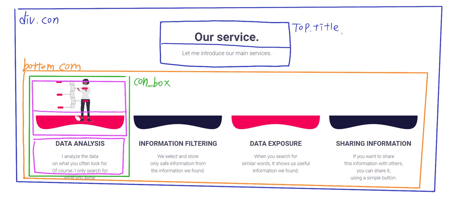
css
.con .top_title {
  width: 100%;
  height: auto;
  text-align: center; /*글씨 박스의 너비를 100%로 채우고 텍스트얼라인으로 정렬, margin 0 auto말고*/
  margin-top: 200px;
  margin-bottom: 50px;
}
.top_title h2 {
  font-size: 50px;
  font-weight: 600;
  margin-bottom: 30px;
}
.top_title p {
  font-size: 24px;
}
.bottom_con {
  width: 100%;
  overflow: hidden;
  display: flex;
  justify-content: space-between;
  flex-flow: row wrap; /*반응형을 위해서*/
  margin-bottom: 200px;
}
/* 모션들어가는 박스 */
.con_box {
  width: 371px; /*바닥이미지 사진이 가로로 371이여서*/
  overflow: hidden;
  text-align: center;
}
.con_box > .picture {
  width: 100%;
  height: 250px;
  position: relative;
}
.picture > .human {
  position: absolute;
  left: 50%;
  margin-left: -100px; /*left50%로 가운데로 보낸다음에 마진레프트로 이미지 사이즈의 반정되되는 만큼 끌어당겨준다.*/
  z-index: 15;
  top: 0px; /*탑 위치 지정해주는 거 잊지말기 기본위치*/
  opacity: 0; /*투명도로 숨김*/
  transition: 0.5s;
}
.picture > .floor {
  position: absolute;
  left: 0;
  bottom: 0;
  max-width: 100%;
}
.con_box:hover .human {
  opacity: 1;
  top: 38px;
}
.pic_text {
  width: 100%;
  overflow: hidden;
  margin-top: 40px;
}
.pic_text > h3 {
  font-size: 28px;
  font-weight: 600;
  text-transform: uppercase;
}
.pic_text > p {
  line-height: 30px;
  margin-top: 20px;
}
- top_title 글씨들은 따로 박스를 가운데로 margin 0 auto로 보내는 게 아니라 글씨 박스 width를 100%로 맞춰서 text-align center 로 가운데 정렬해줬다.
<섹션 4>

<section id="perfect">
          <div class="top_title">
            <h2>This perfect app is free!</h2>
            <p>
              The only app that will give you a new experience.<br />
              Download it right now.
            </p>
          </div>
          <div class="app_button">
            <button class="apple" type="button">
              <img src="./img/apple.png" alt="앱스토어" />
              <span>App store</span>
              <!--스판으로 글씨를 묶어준다-->
            </button>
            <button class="android" type="button">
              <img src="./img/android.png" alt="플레이스토어" />
              <span>Play store</span>
            </button>
          </div>
        </section>
버튼은 버튼 태그로 만들고 이미지랑 글씨 정렬해주기위해서 글씨를 span으로 묶어줬다.
버튼 태그는 이미지를 넣고 꾸미기가 더 유연하다.
css
#perfect {
  background-color: #f7f7f7;
  padding: 150px 0;
  text-align: center;
}
.app_button {
  width: fit-content;
  height: fit-content;
  margin: 0 auto;
  margin-top: 80px;
  display: flex; /*반응형까지 고려해서*/
  column-gap: 40px;
}
.app_button button {
  width: fit-content;
  height: fit-content;
  border: none;
  outline: none;
  background-color: #f50057;
  color: #fff;
  display: flex; /*글씨하고 아이콘이미지 정렬해주기 위해 글씨들을 span으로 묶어서 디스플레이로 정렬*/
  align-items: center;
  column-gap: 10px;
  font-size: 20px;
  padding: 15px 90px;
  border-radius: 50px;
  font-weight: 600;
  cursor: pointer;
}
.app_button .android {
  background-color: #19163c;
}
.app_button .apple:hover {
  background-color: rgba(245, 0, 87, 0.5);
}
.app_button .android:hover {
  background-color: rgba(25, 22, 60, 0.5);
}
span으로 묶은 버튼 글씨와 이미지는 display: flex; 랑 align-items: center; 로 정렬
<섹션 5>

<section id="last">
          <div class="con">
            <div class="top_title">
              <h2>Is there a problem?</h2>
              <p>
                Please leave your name, email address,<br />
                and problem on this form.<br />
                Personal information is strictly secured.
              </p>
            </div>

            <form action="#" method="post">
              <!-- 이름 -->
              <div class="input_box">
                <label for="user_name">* Name</label>
                <input type="text" id="user_name" name="user_name" />
              </div>
              <!-- 이메일 -->
              <div class="input_box">
                <label for="user_email">* Email</label>
                <input type="email" id="user_email" name="user_email" />
              </div>
              <!-- 질문 -->
              <div class="input_box">
                <label for="question">* Questions</label>
                <textarea name="question" id="question"></textarea>
                <!-- sand 버튼 -->
                <button>SAND</button>
              </div>
            </form>
          </div>
        </section>
      </main>
css
#last .con {
  display: flex;
  justify-content: space-between;
  align-items: center;
}
#last .top_title {
  text-align: left;
  margin-top: 0; /*위에서 넣어놓은 거 초기화*/
}
#last p {
  font-size: 30px;
  font-weight: 100;
  line-height: 48px;
}
.con form {
  width: 80%;
  height: auto;
  border-top: 1px solid #19163c;
  border-bottom: 1px solid #19163c;
  box-sizing: border-box;
  padding: 50px 80px;
  margin: 150px 0;
}
form .input_box {
  width: 100%;
  height: 50px;
  position: relative;
  margin-bottom: 20px;
}
form .input_box:last-child {
  height: 300px;
}
.input_box label {
  position: absolute;
  top: 0;
  left: 0;
}
.input_box input {
  position: absolute;
  right: 0;
  width: 80%;
  height: 50px;
  box-sizing: border-box;
  background-color: #eee;
  border: none;
  padding-left: 20px;
  font-size: 16px;
  color: #3f3d56;
}
/* 포커스 되었을때 배경 색 바뀌어라 */
.input_box input:focus {
  background-color: beige;
}
.input_box textarea {
  position: absolute;
  right: 0;
  width: 80%;
  height: 100%;
  box-sizing: border-box;
  background-color: #eee;
  border: none;
  padding: 20px;
  font-size: 16px;
  color: #3f3d56;
  font-family: "Roboto", sans-serif; /*텍스트아리아는 기본글꼴이 굴림이라 따로 지정해줘야한다*/
}
.input_box textarea:focus {
  background-color: beige;
}
.input_box button {
  position: absolute;
  right: 20px;
  bottom: 20px;
  width: 150px;
  height: 50px;
  border-radius: 25px;
  background-color: #19163c;
  border: none;
  color: #fff;
  font-size: 18px;
  transition: 0.3s;
  cursor: pointer;
  box-shadow: 0px 1px 10px rgba(0, 0, 0, 0.5);
}
.input_box button:hover {
  background-color: #f50057;
}

* from태그는 블록속성 박스라 박스처럼 구조 짜주면 된다.
- 텍스트아리아 태그에는 플레이스홀더를 쓸 수 없다.
'예제 실습' 카테고리의 다른 글
| [자바스크립트] - 예제실습 ) pexels 사이트같은 라이트 박스 만들기 (0) | 2024.08.08 |
|---|---|
| 실습) lnb 아코디언 메뉴바 / 2차, 1차 메뉴 css 정리 (0) | 2024.07.02 |
| 실습) iLovePDF 사이트 클론코딩-2 같이 해본 버전 (0) | 2024.06.28 |
| 실습) iLovePDF 사이트 클론 코딩-1 혼자 해본 버전 (0) | 2024.06.27 |
| 실습) split shire 사이트 클론 코딩 (0) | 2024.06.25 |


